
GoodGame Instagram Identity & SMM Concept
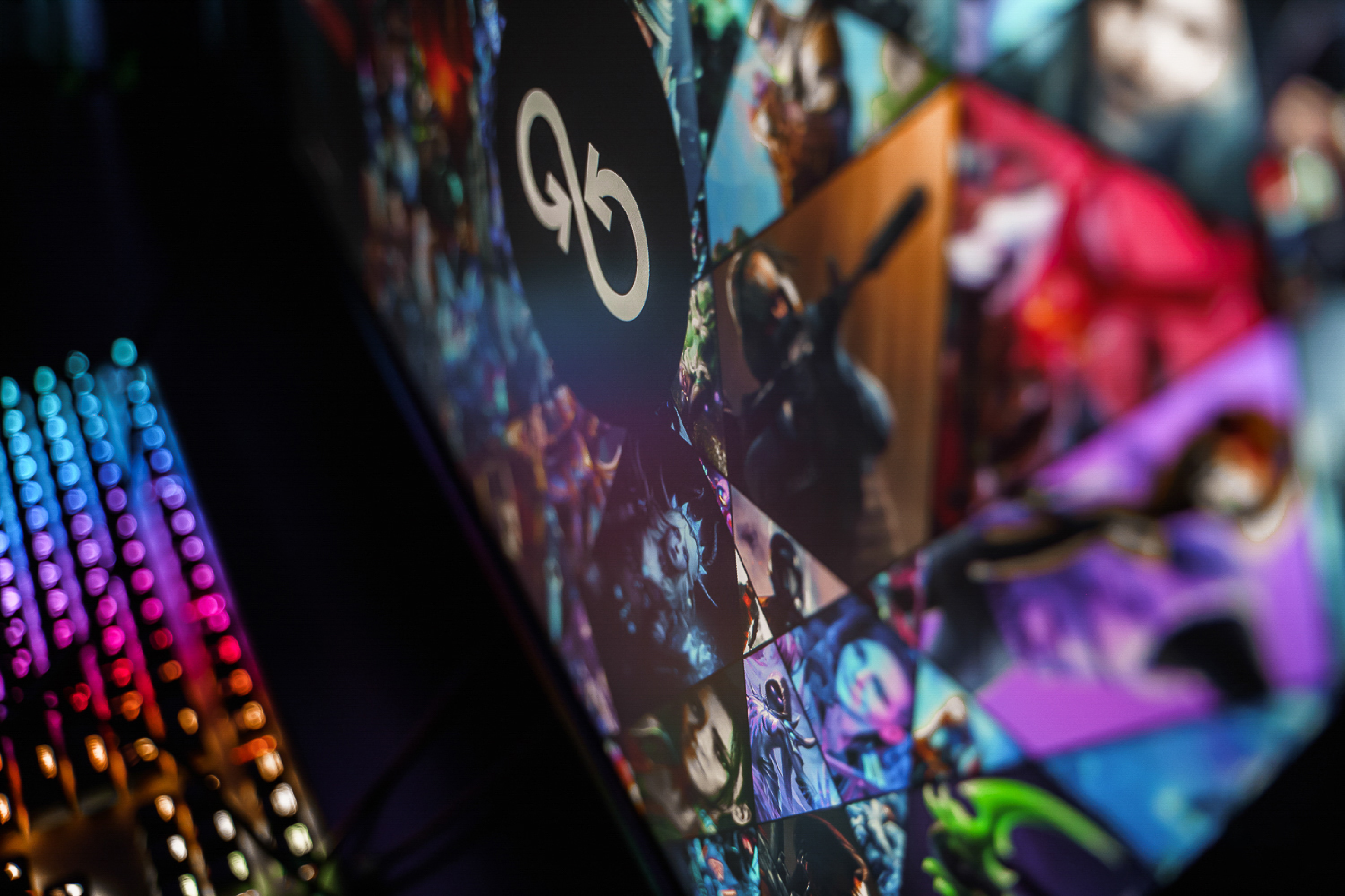
THE CHALLENGE
Develop a cohesive social media visual identity for a premium esports club. The scope included designing a 24-post grid concept, defining a flexible visual template system for key content pillars, and producing custom motion graphics - all strictly aligned with the brand's bold cyberpunk aesthetic.
About the Brand
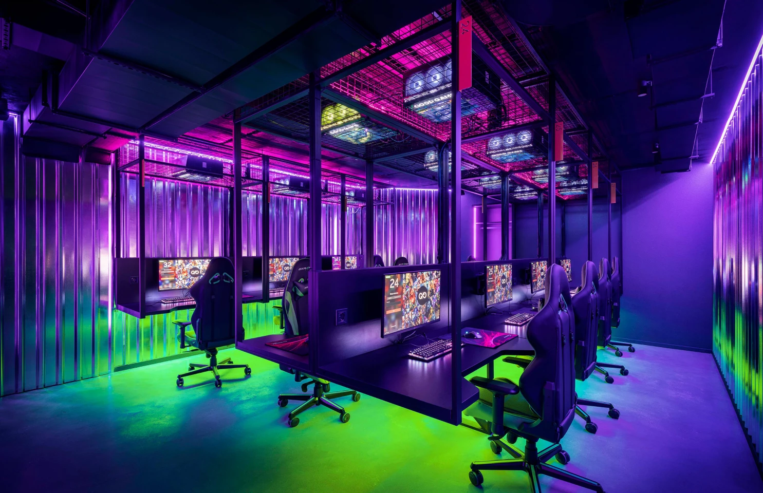
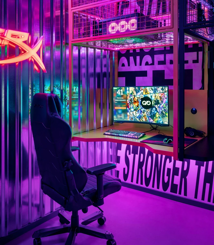
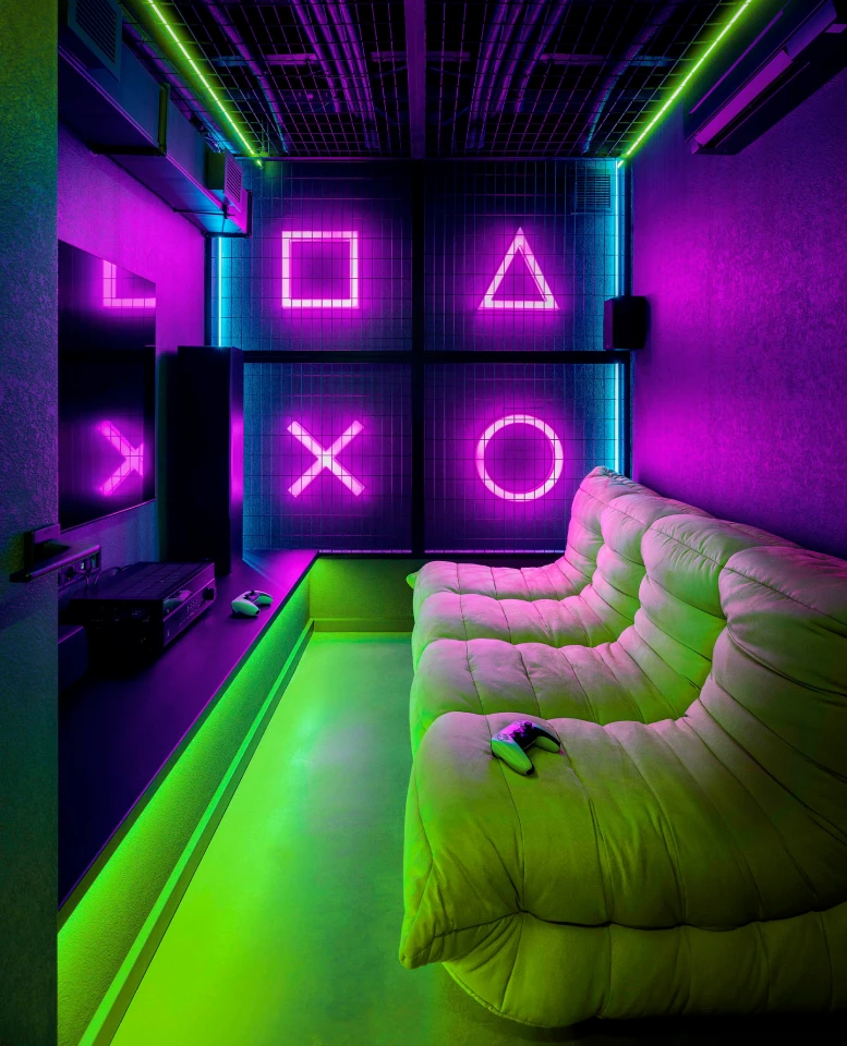
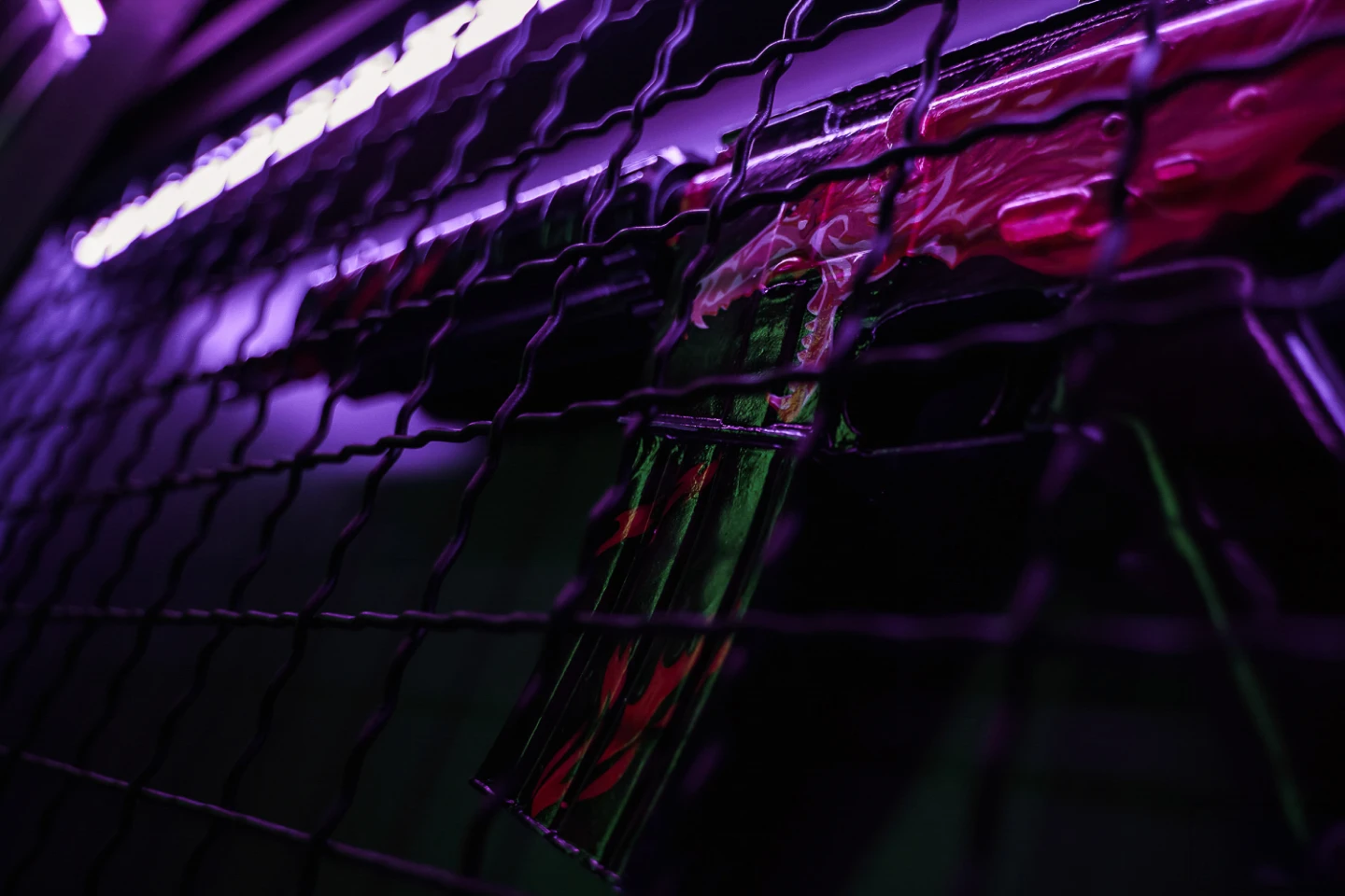
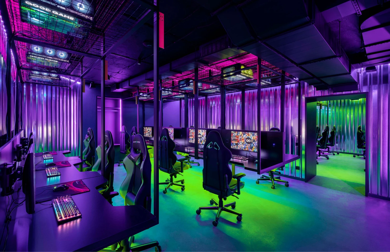
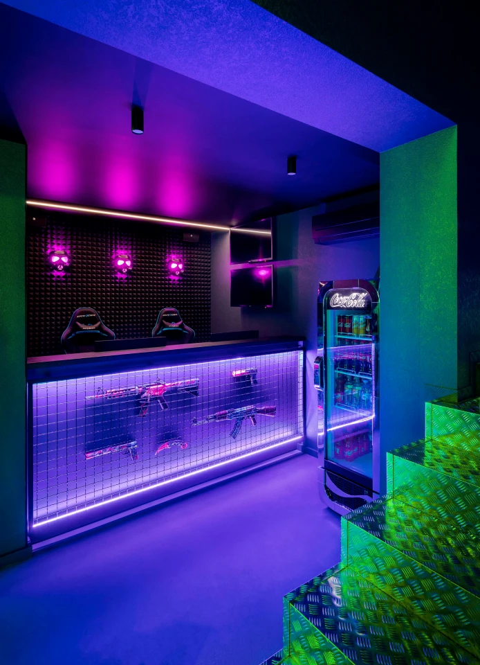
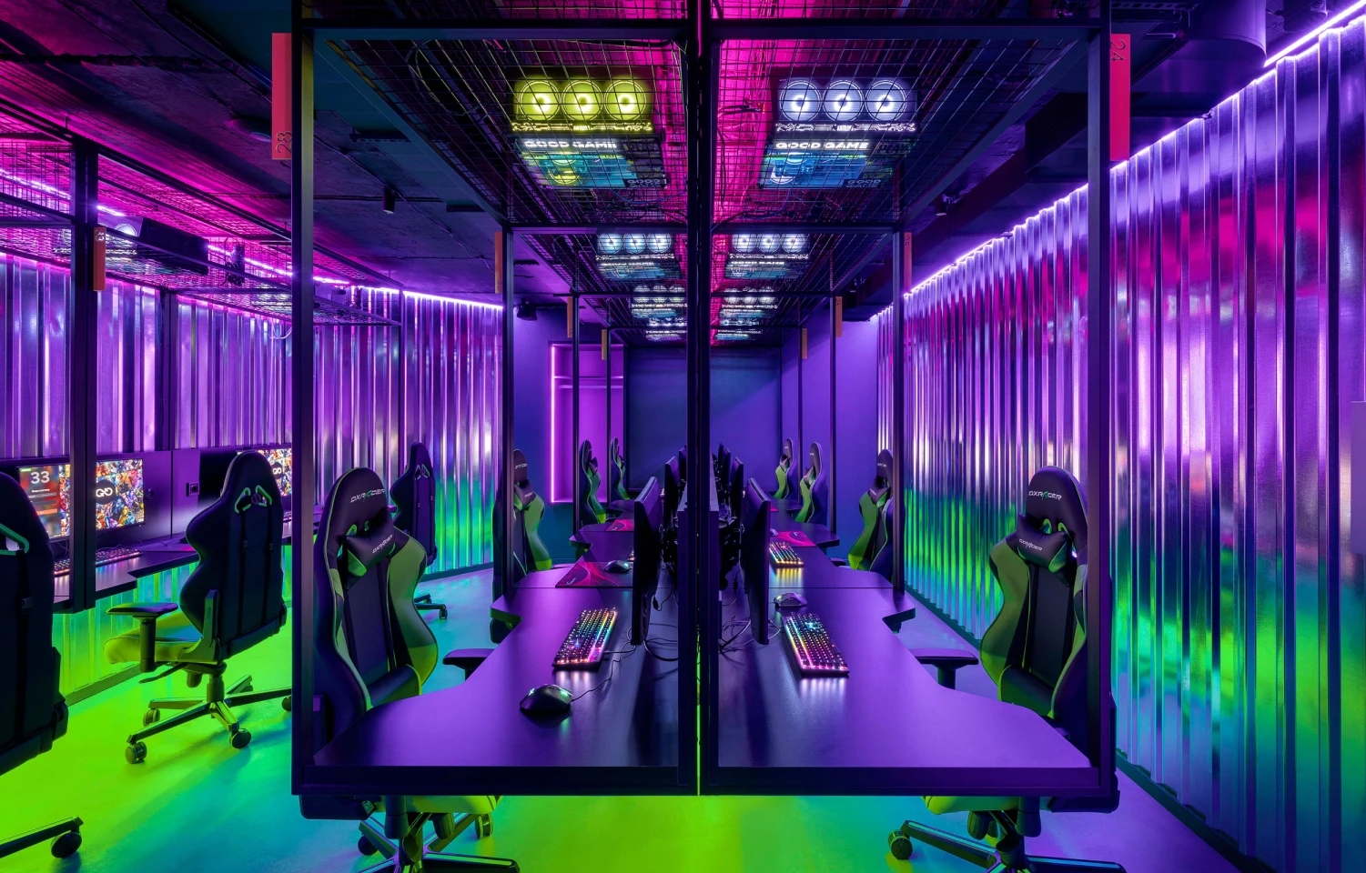
GOOD GAME is a next-level esports and relaxation space featuring 42 high-end PCs across 4 gaming zones, a PS5 Luxe Room with an 86" 4K screen, and a Michelin-trained brand chef menu. Designed for ultimate ergonomics, it offers wall-mounted monitors, unique legless tables, and custom hands-free hookah holders for an uninterrupted gaming experience.
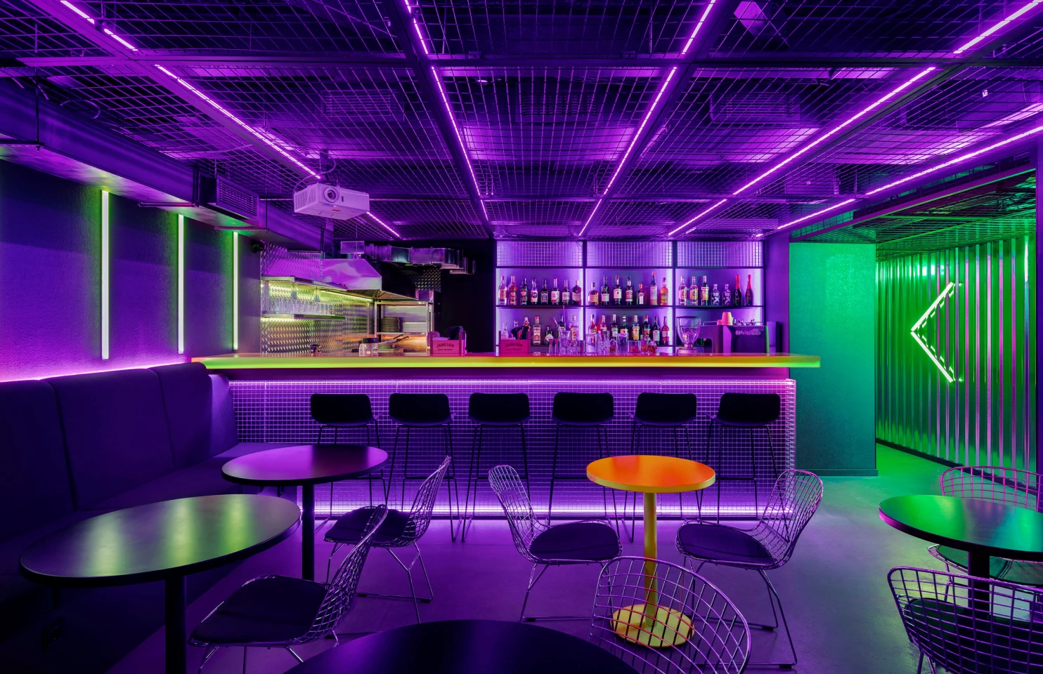
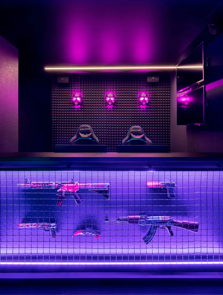
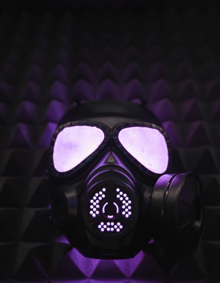
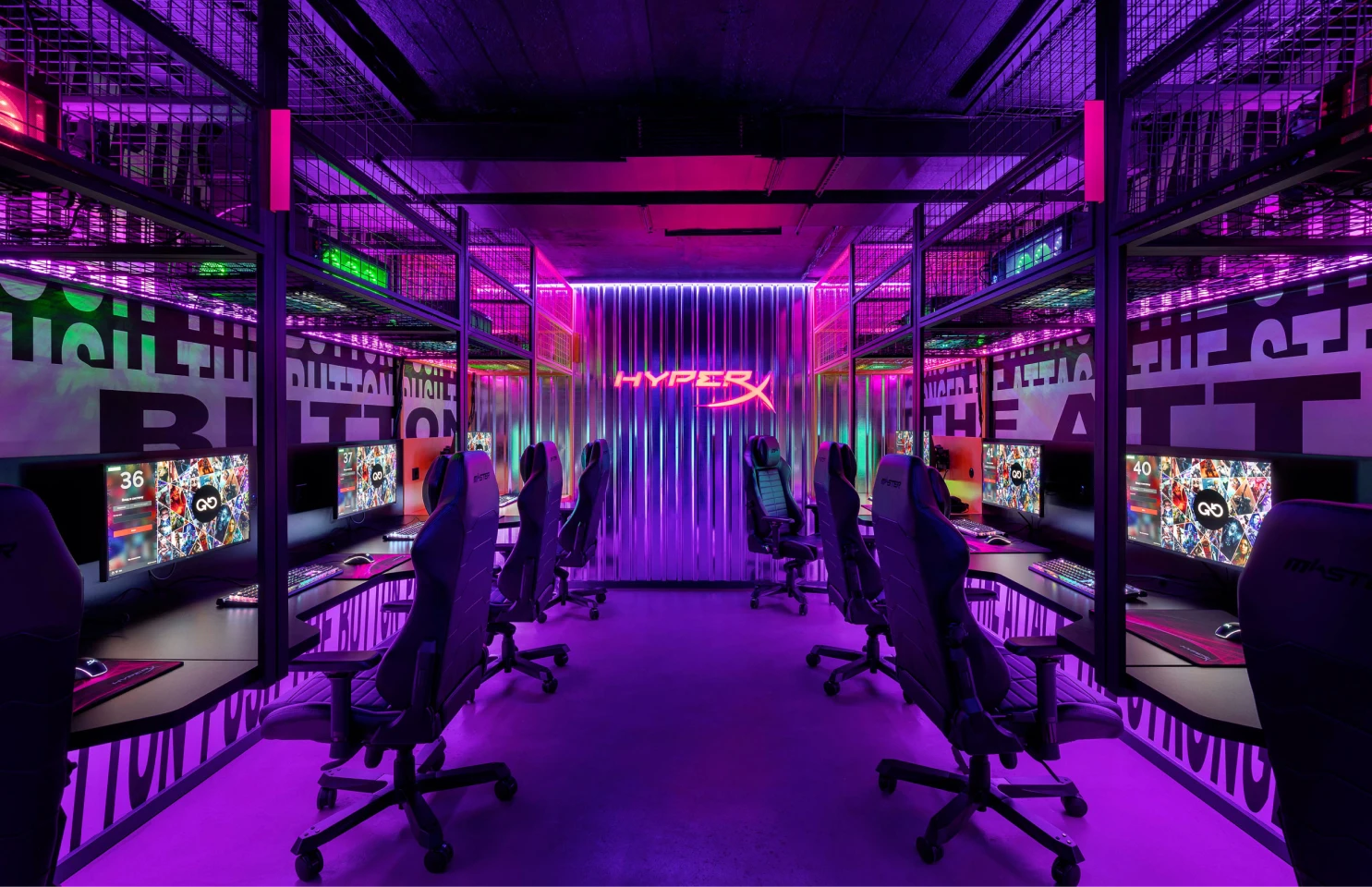
DESIGN SYSTEM & GUIDELINES
To maintain strong visual consistency across all digital touchpoints, the social media system strictly adhered to the core brand guidelines - balancing high-energy cyber aesthetics with functional, structured layouts.
Color Palette
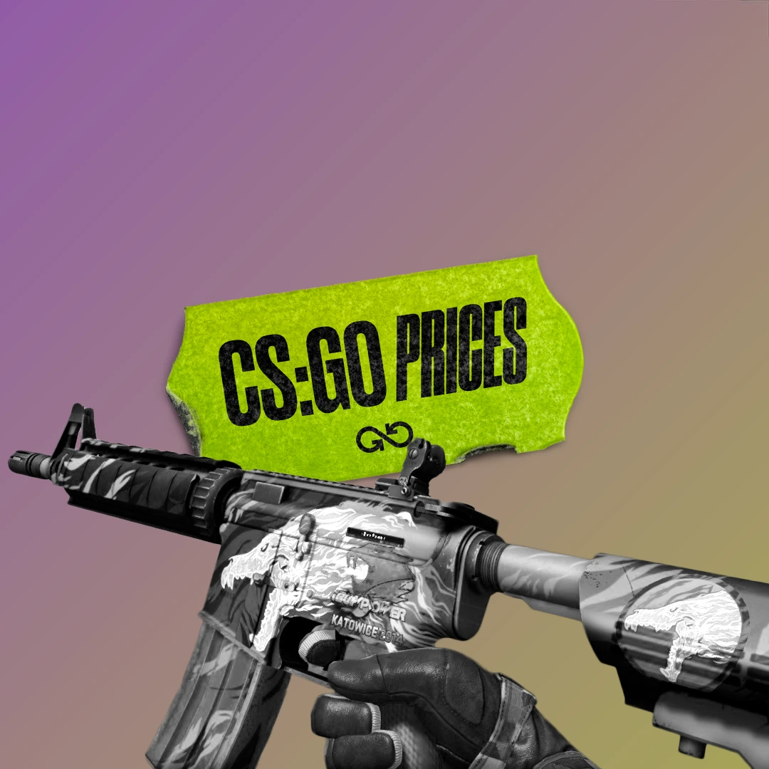
The signature GOOD GAME palette thrives on the high-contrast clash of Acid Yellow and Ultraviolet, grounded by deep black and pure white. When choosing a primary background, black is always preferred. A neutral grey tone complements the palette, softening its visual aggression.
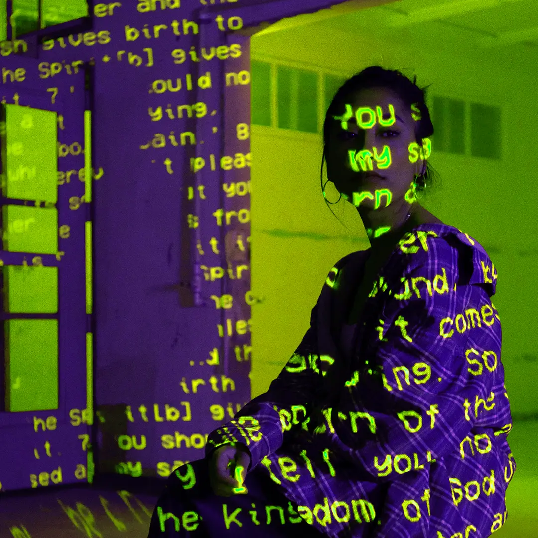
Print & Digital Execution: Standard laser printing cannot reproduce the vivid neon brightness of Acid Yellow and Ultraviolet; in such cases, monochrome graphics are recommended. For accurate color reproduction, offset printing, silkscreen, or PANTONE-certified inks are required. In physical spaces, the palette is brought to life through neon vinyl, UV lighting, and projectors.
Typography System
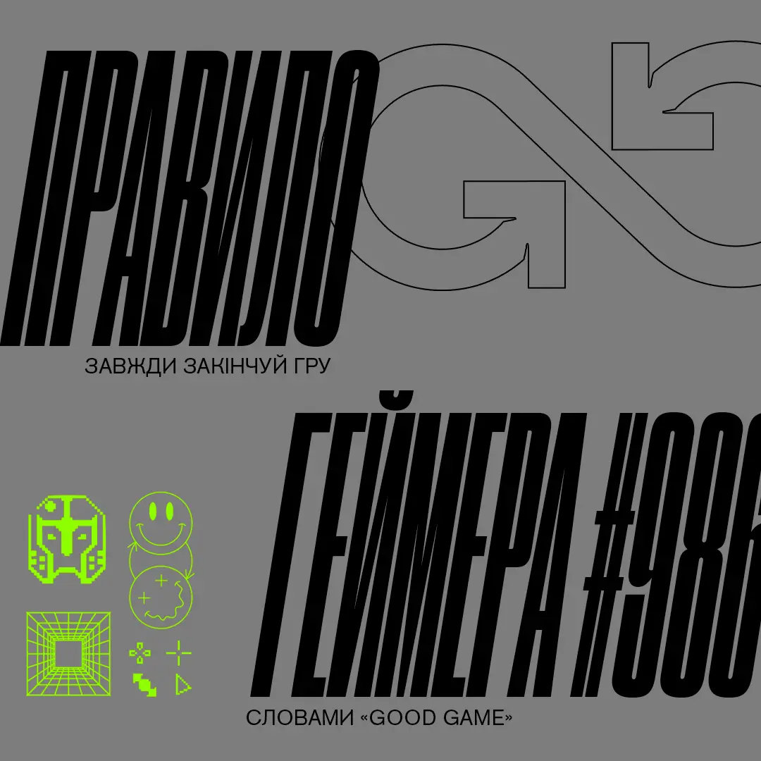
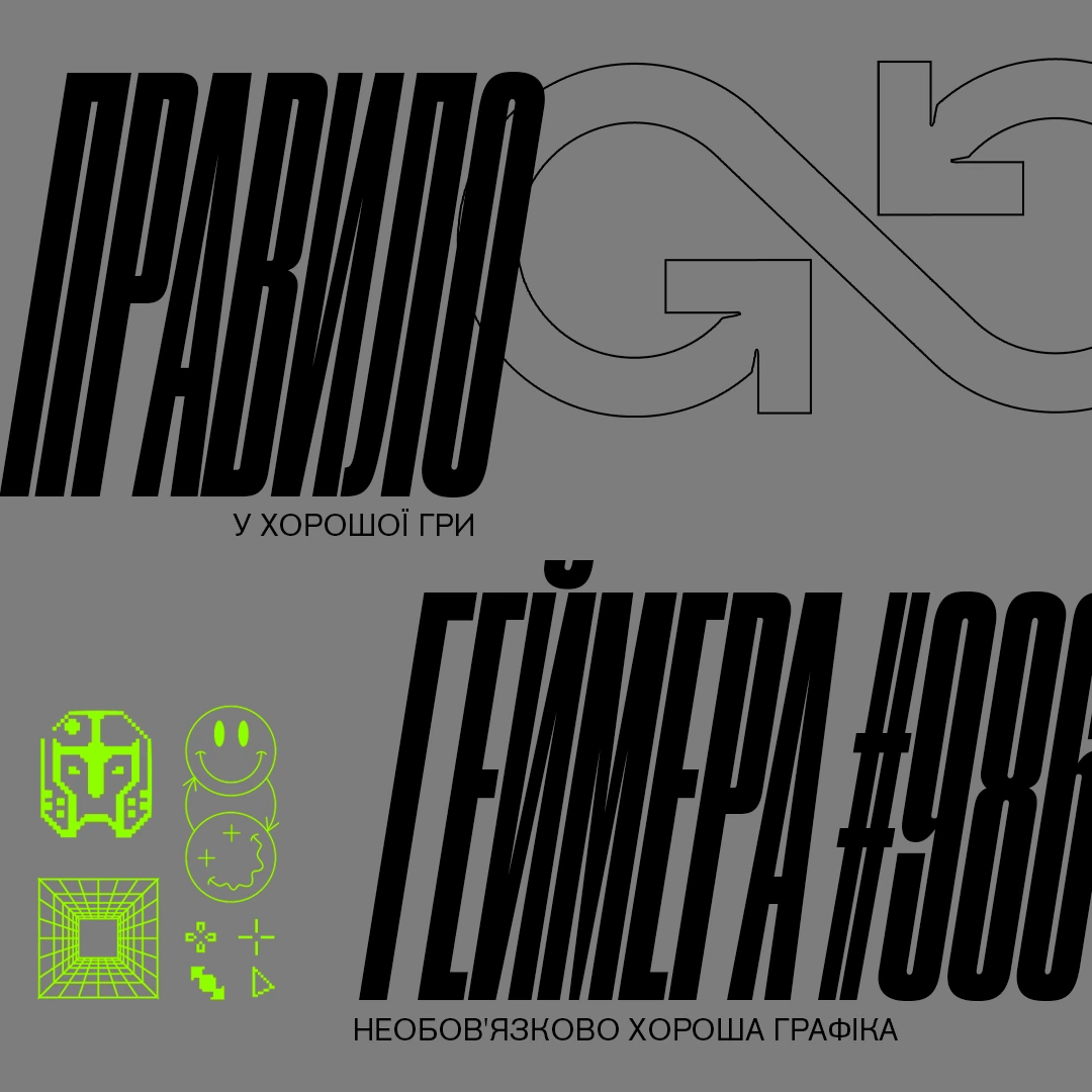
The centerpiece of the typographic identity is the Druk super-family, featuring a dynamic range of proportions from ultra-wide to extra-condensed. The most striking visual impact is achieved by pairing a wide font style on one line with a condensed style on the next. Druk is reserved strictly for large headlines. For body text, captions, footnotes, and functional copy, the clean and highly legible Akzidenz-Grotesk typeface is used.

FEED CONCEPT
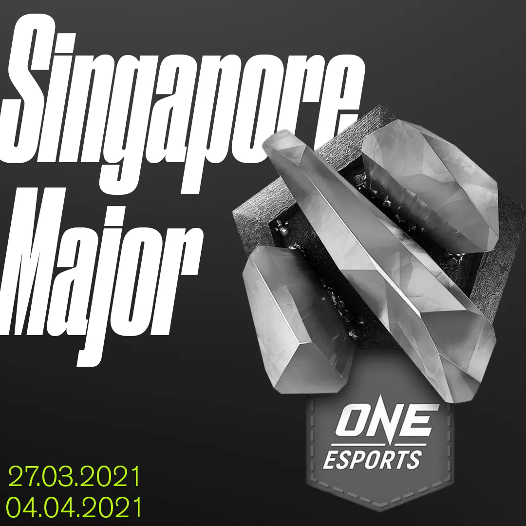
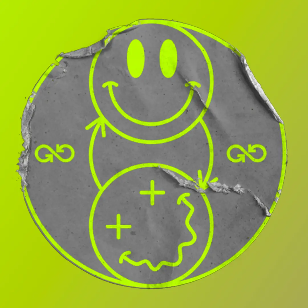
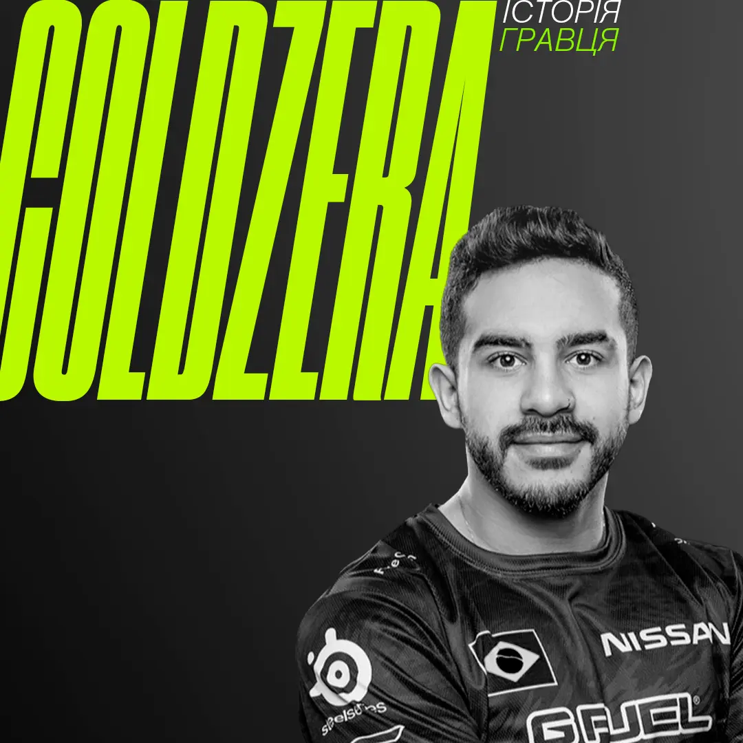
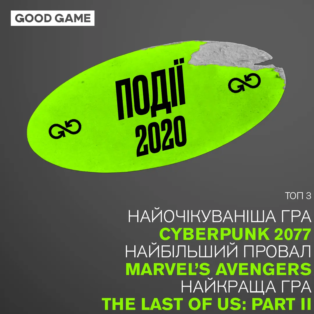
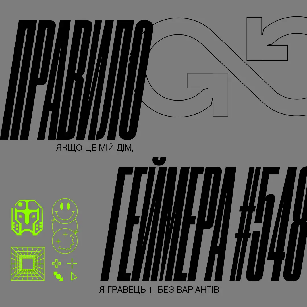
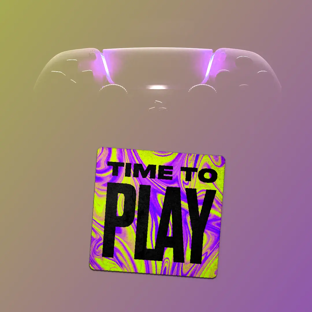
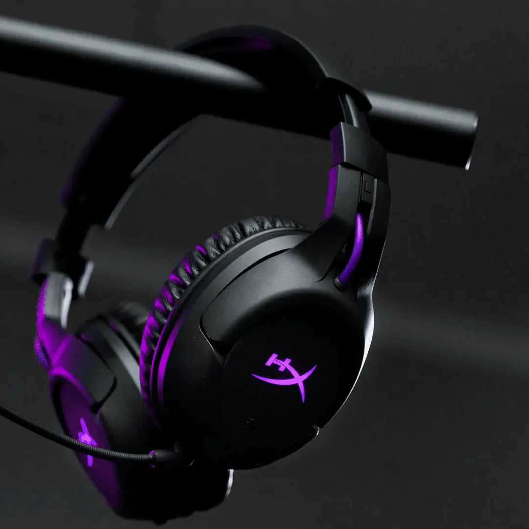
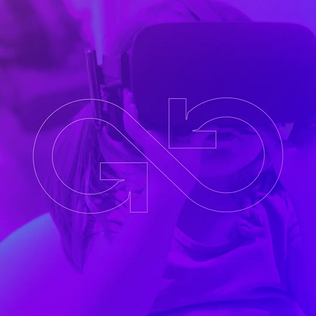
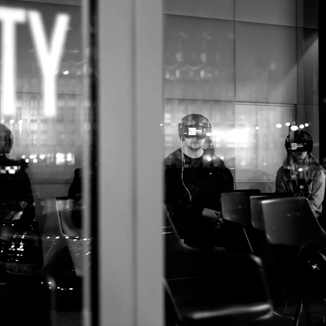
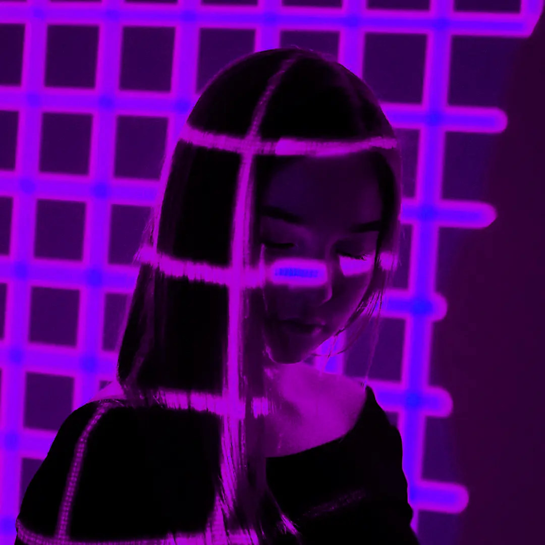
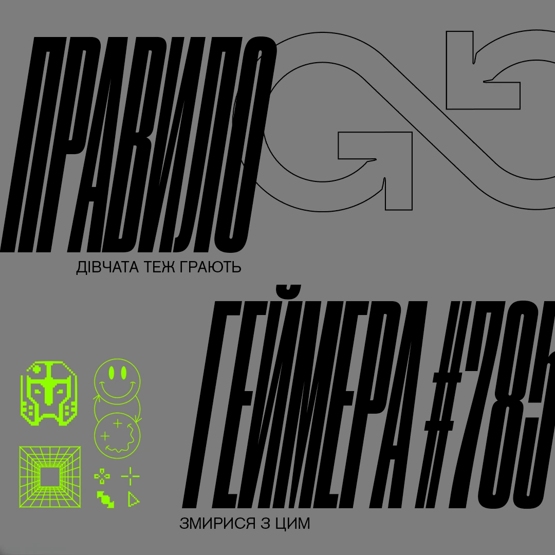
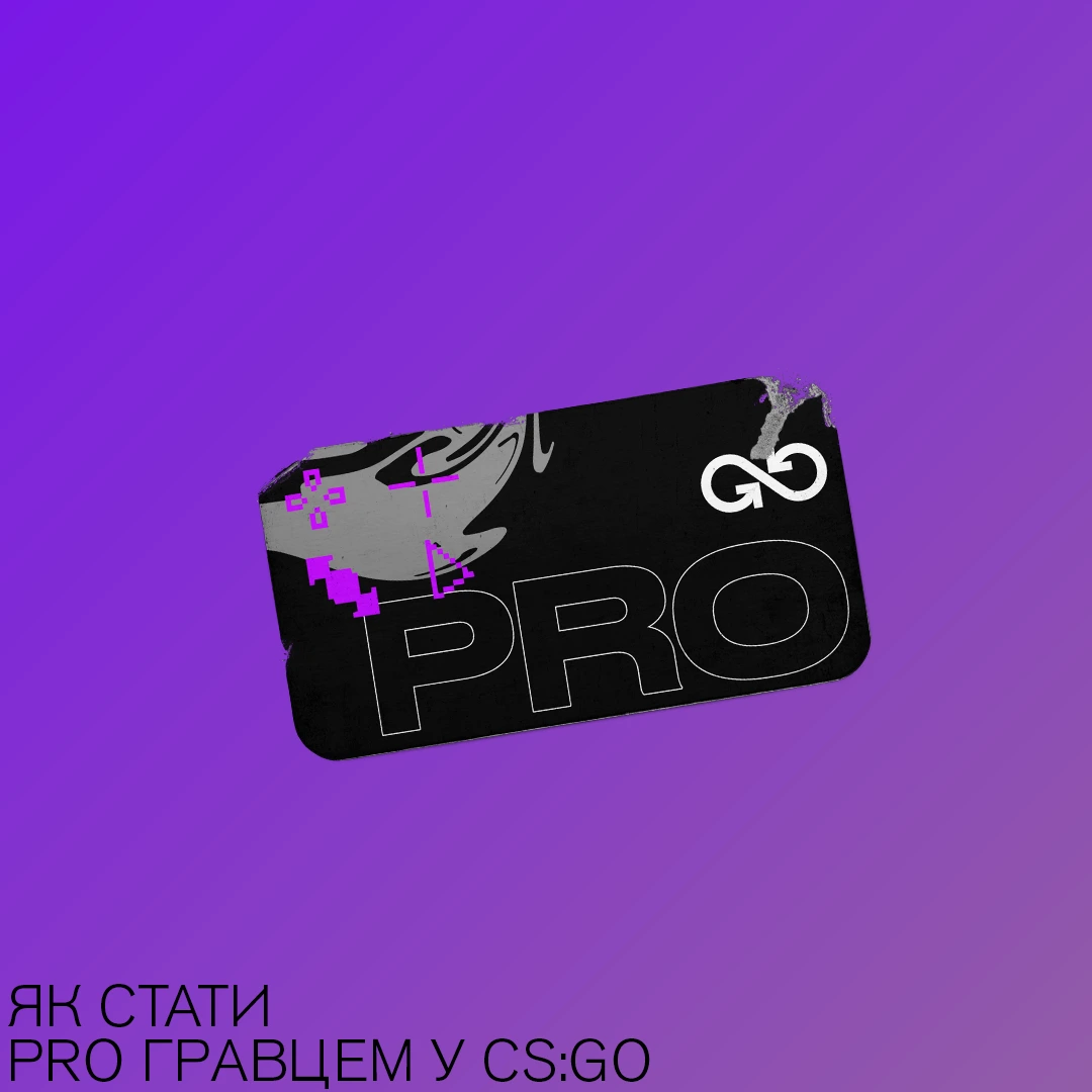
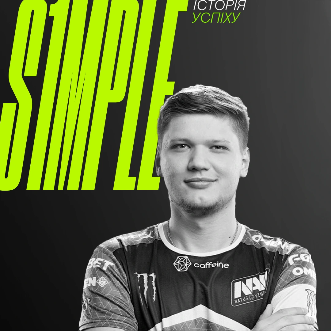
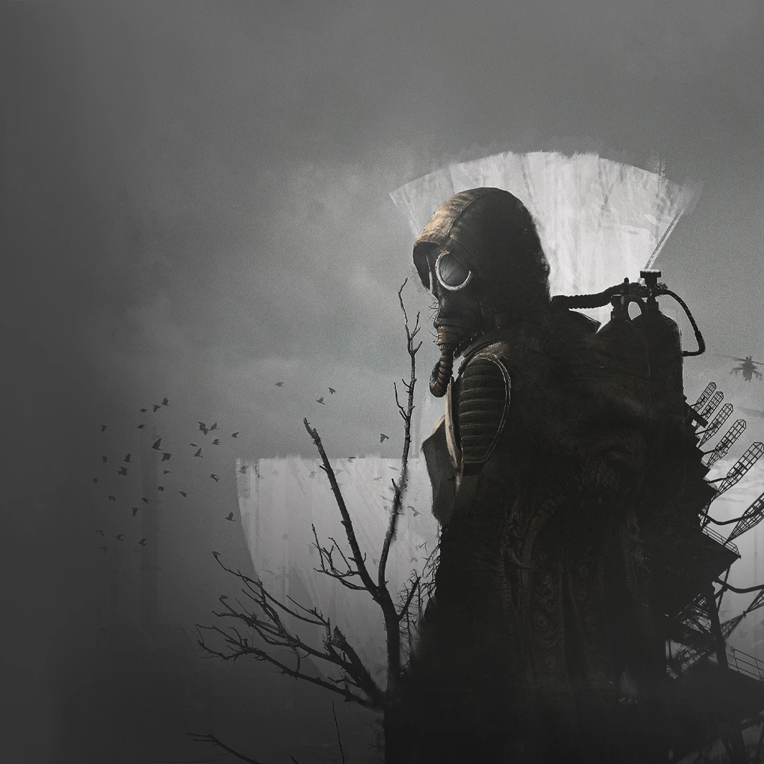
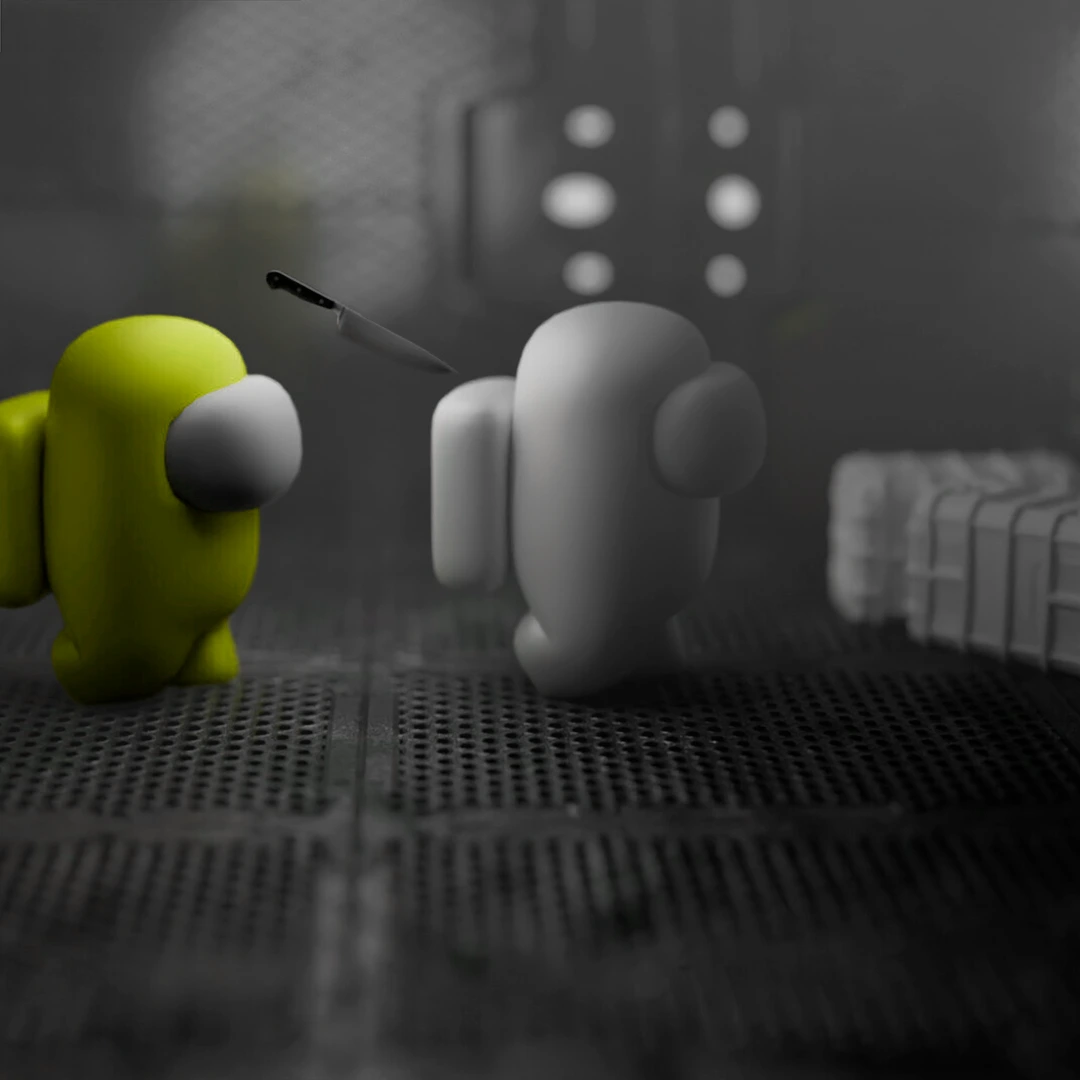
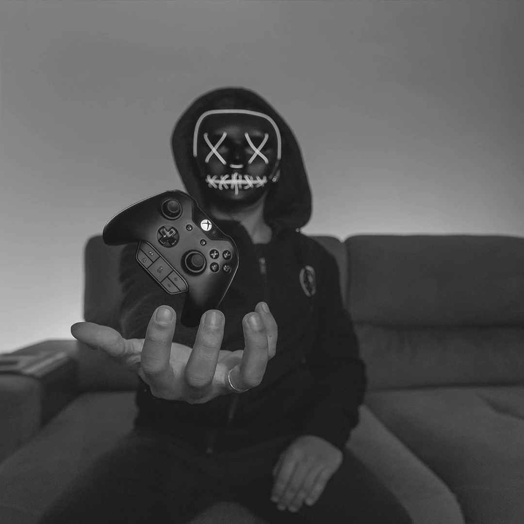
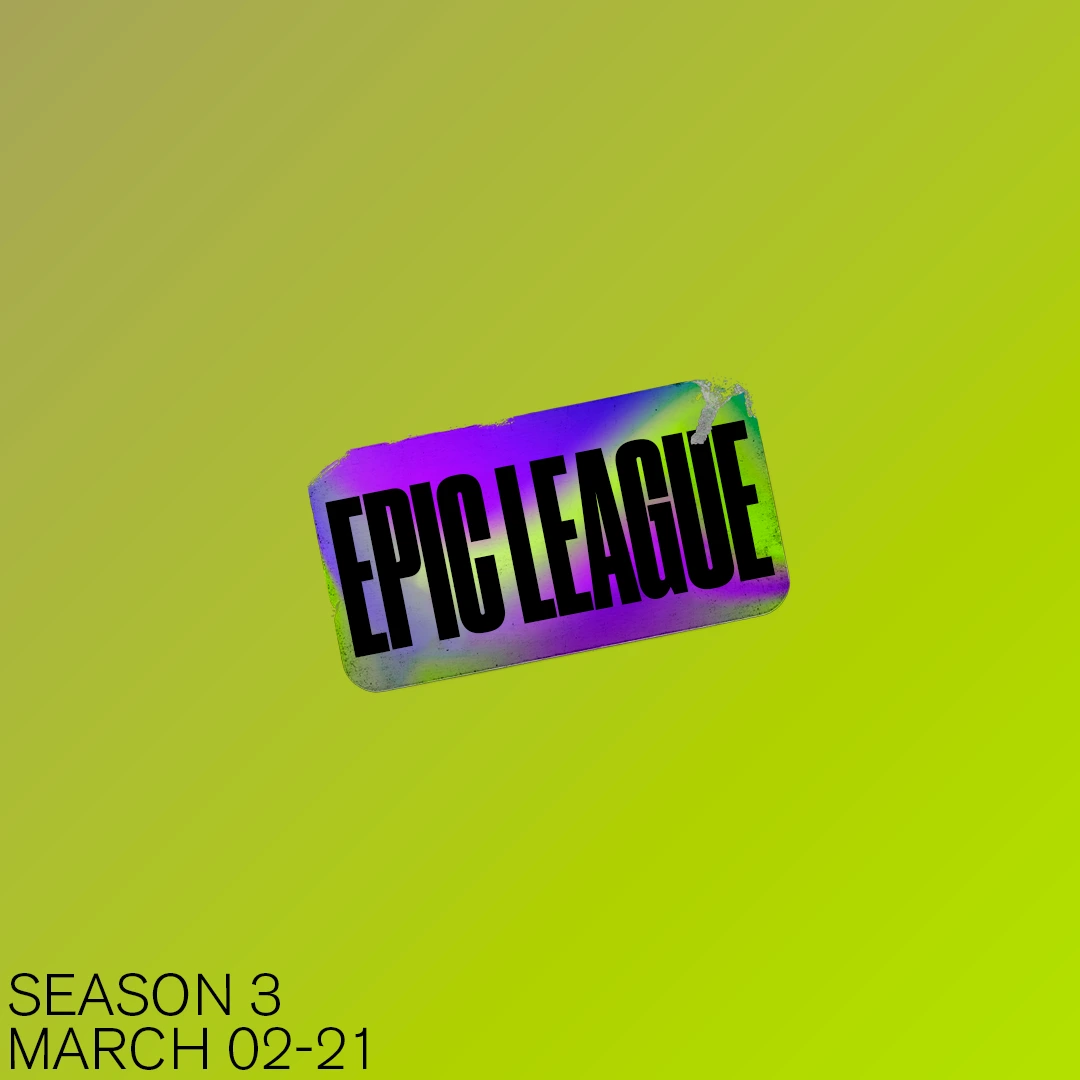
In close alignment with the agency's content strategy, distinct visual templates were established for key content pillars. The 24-post grid combines graphic layouts, authentic on-site photography, and custom motion design — including animated looping graphics — to create a rhythmic, immersive visual feed.
Client
Design Categories
